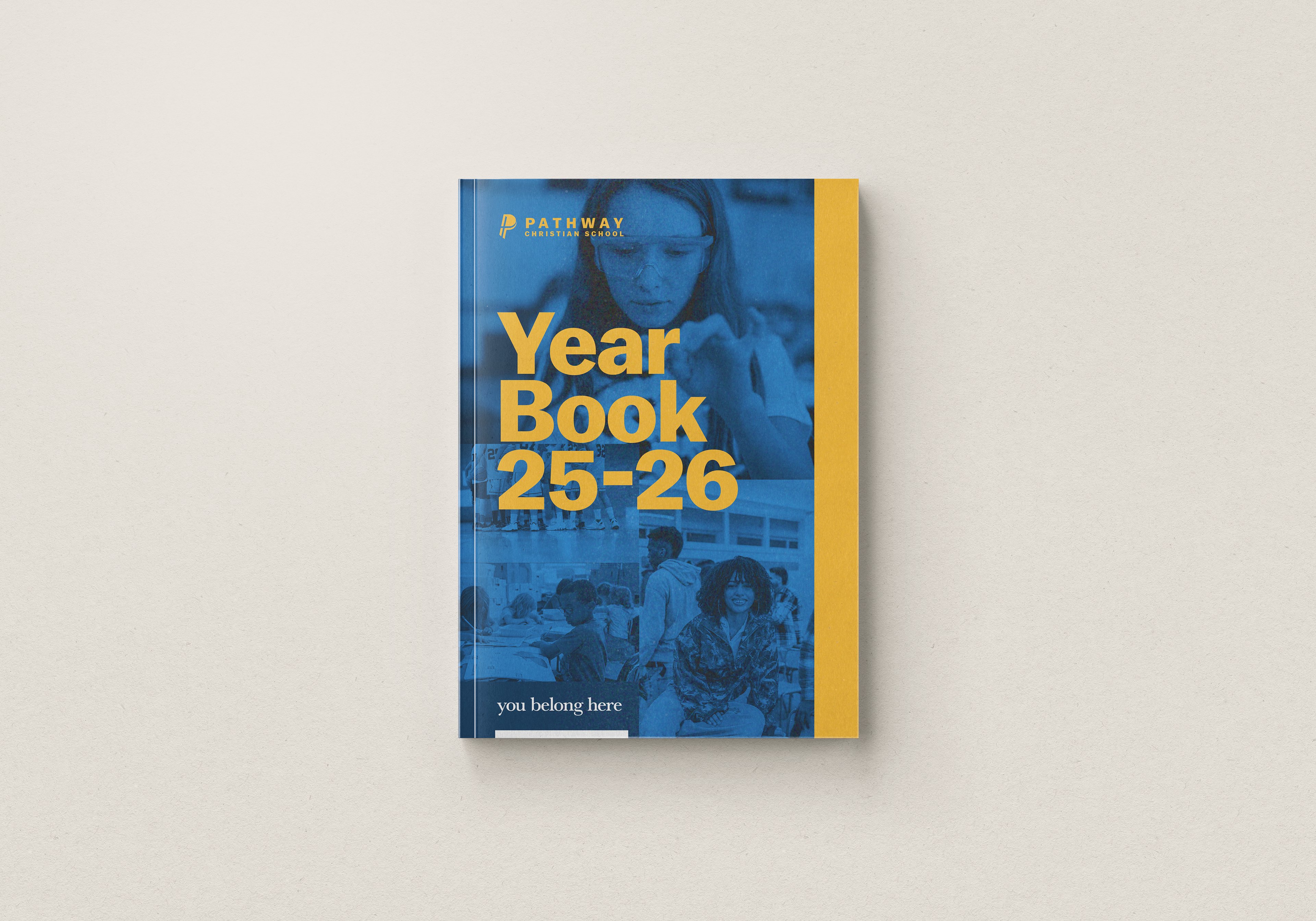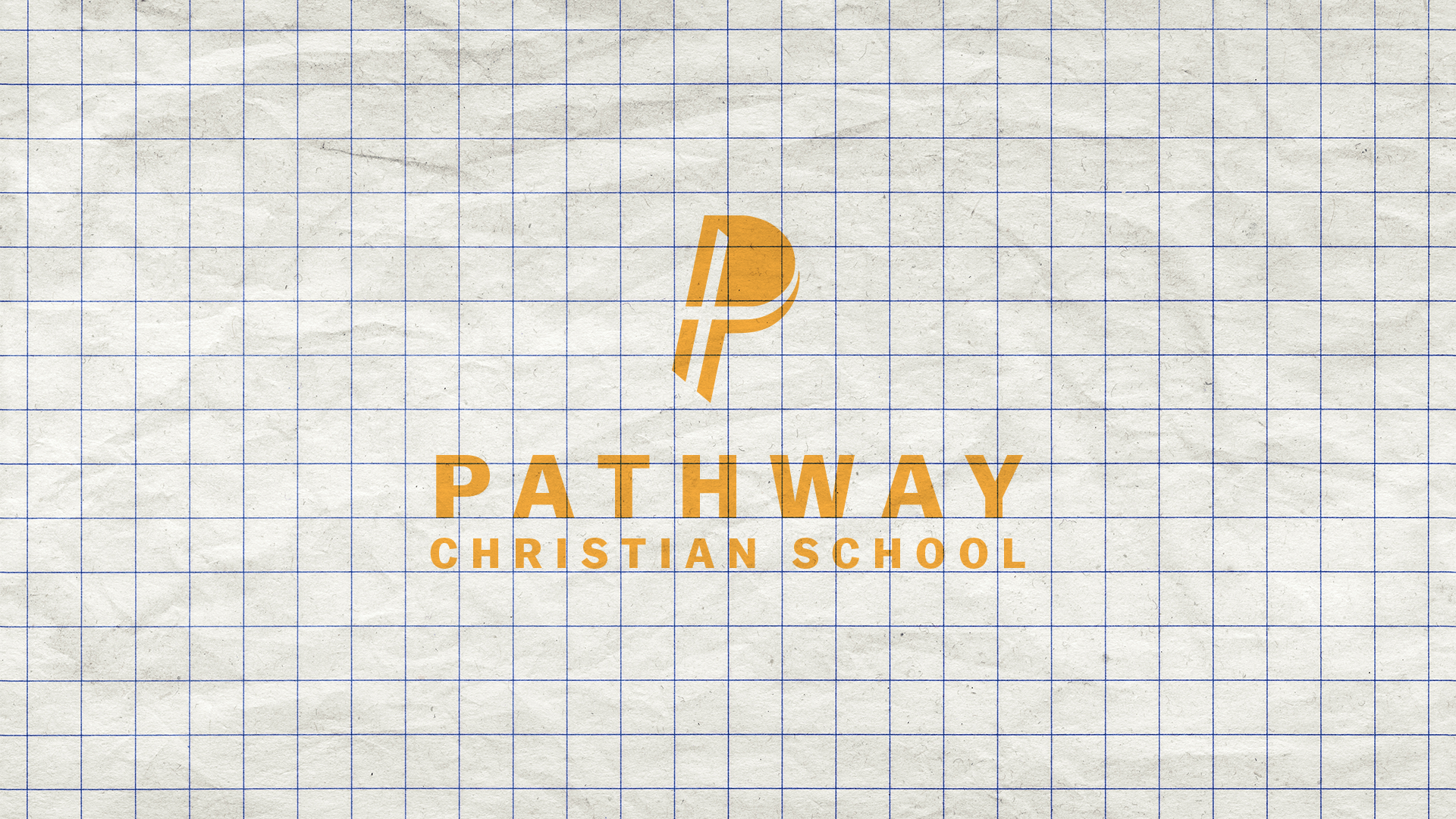
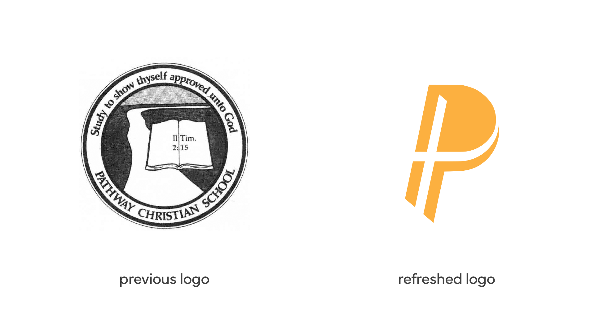
I had the privilege of refreshing Pathway Christian School's brand identity.
Pathway has a tight-knit community with local families who want quality education as well as biblical discipleship for their children. However, there's been an "old school" stigma that Pathway wants to break out of, so we refreshed their visual identity by crafting a modern logo.
Design Process
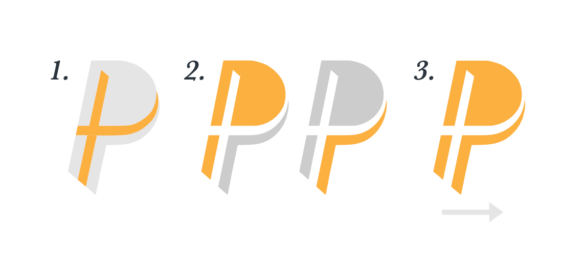
§ Inspired by the pilcrow sign (¶) which signifies the beginning of something new, I used it as the starting point for the new identity.
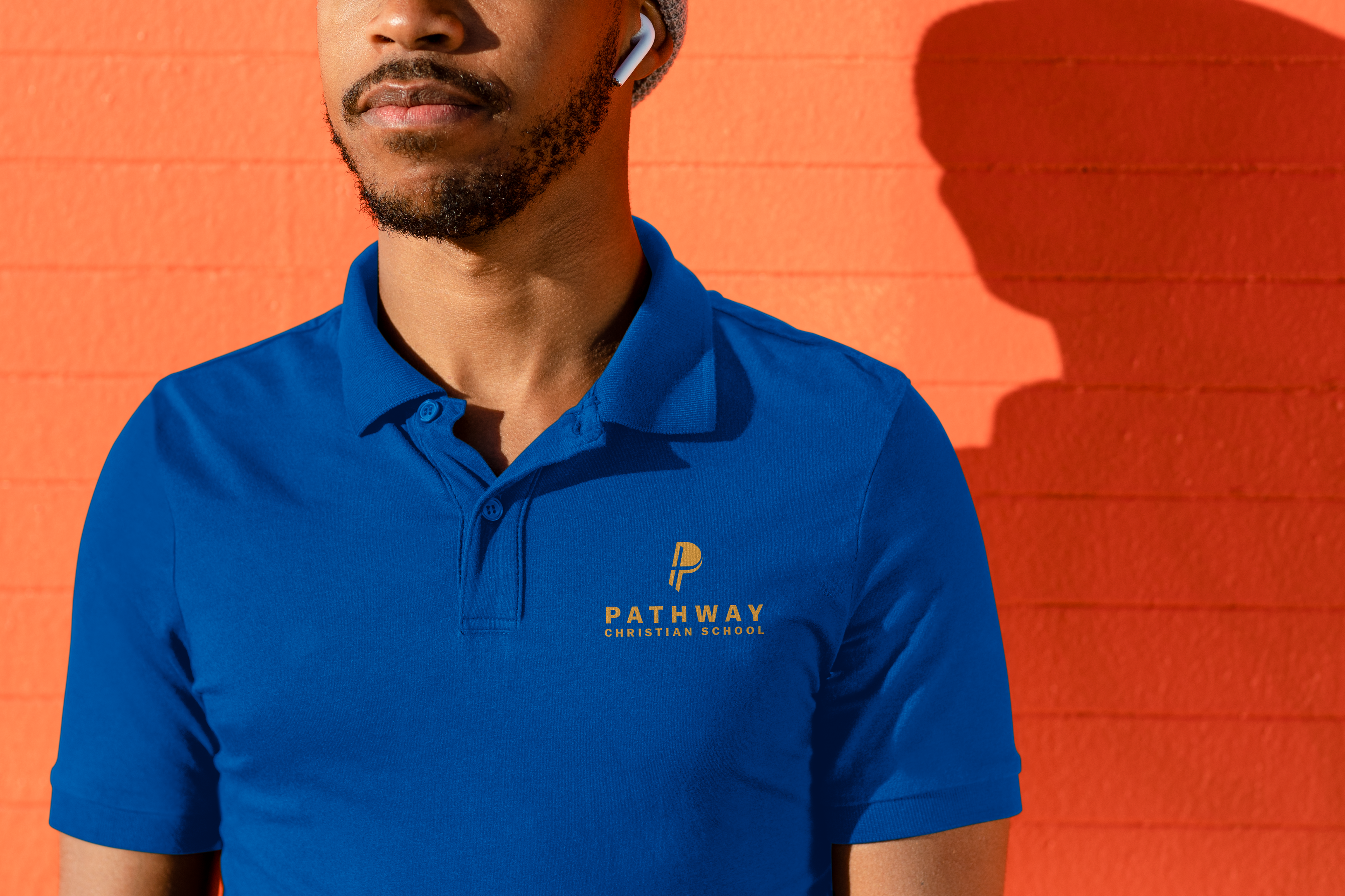
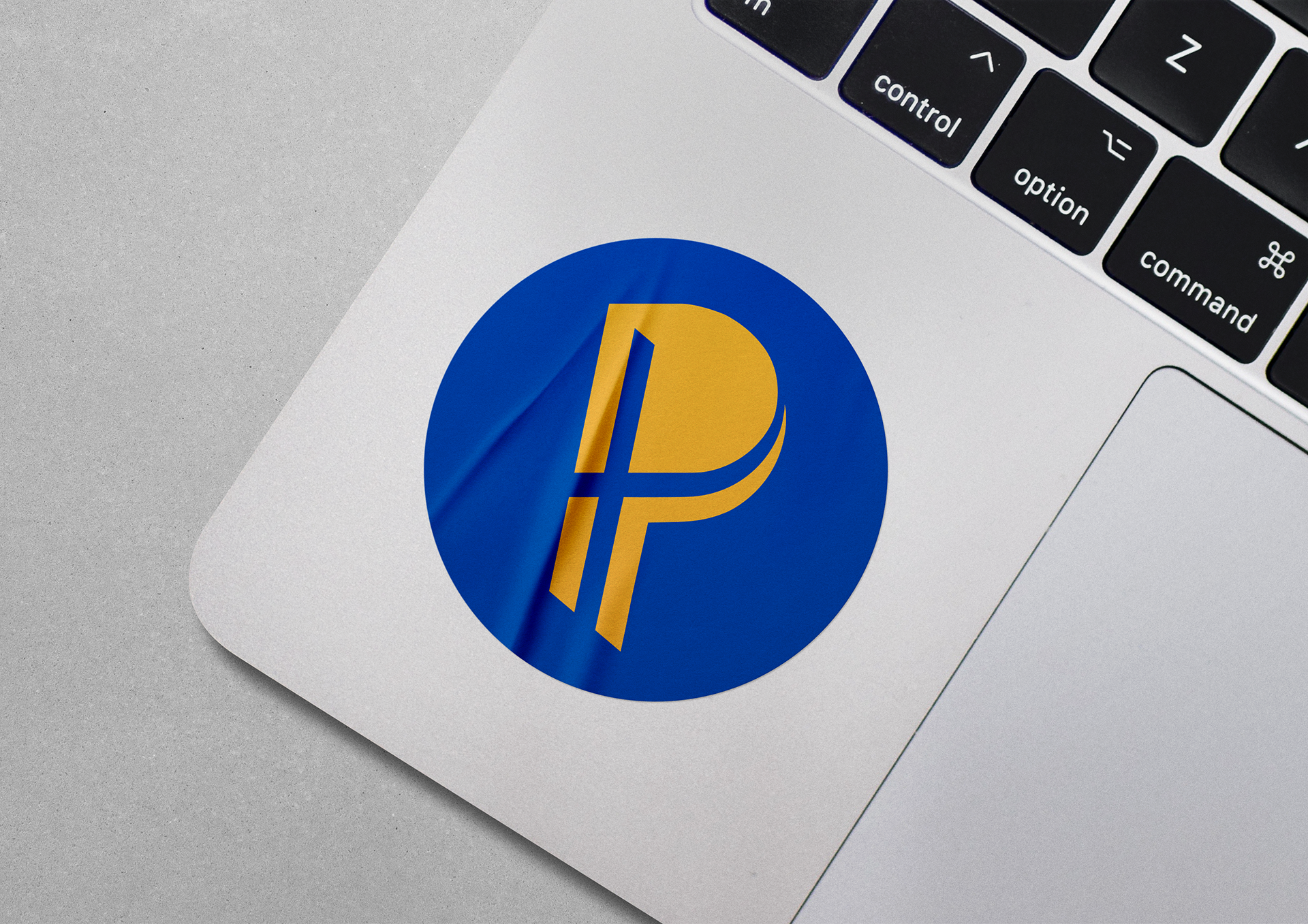
§ We also retained their existing school colors as there's already a strong tie to them. I did advise avoiding other color combinations so as not to be confused with the local university in the area.
1) Pathway's mission is to partner with families to provide an excellent Christ-centered education, where students are anchored in Christ. With that in mind, I used a negative space cross to reflect how Jesus is at the center of everything Pathway does.
2) To piggyback on the last note, parent-Pathway partnership is represented in the double Ps stacked in the logo.
3) The logo is slanted forward to signify modernity.